Elegant Greenery Inspired Wedding Shoot
Happy Friday!
I am SO stoked to finally share the editorial shoot we shot a few months back.
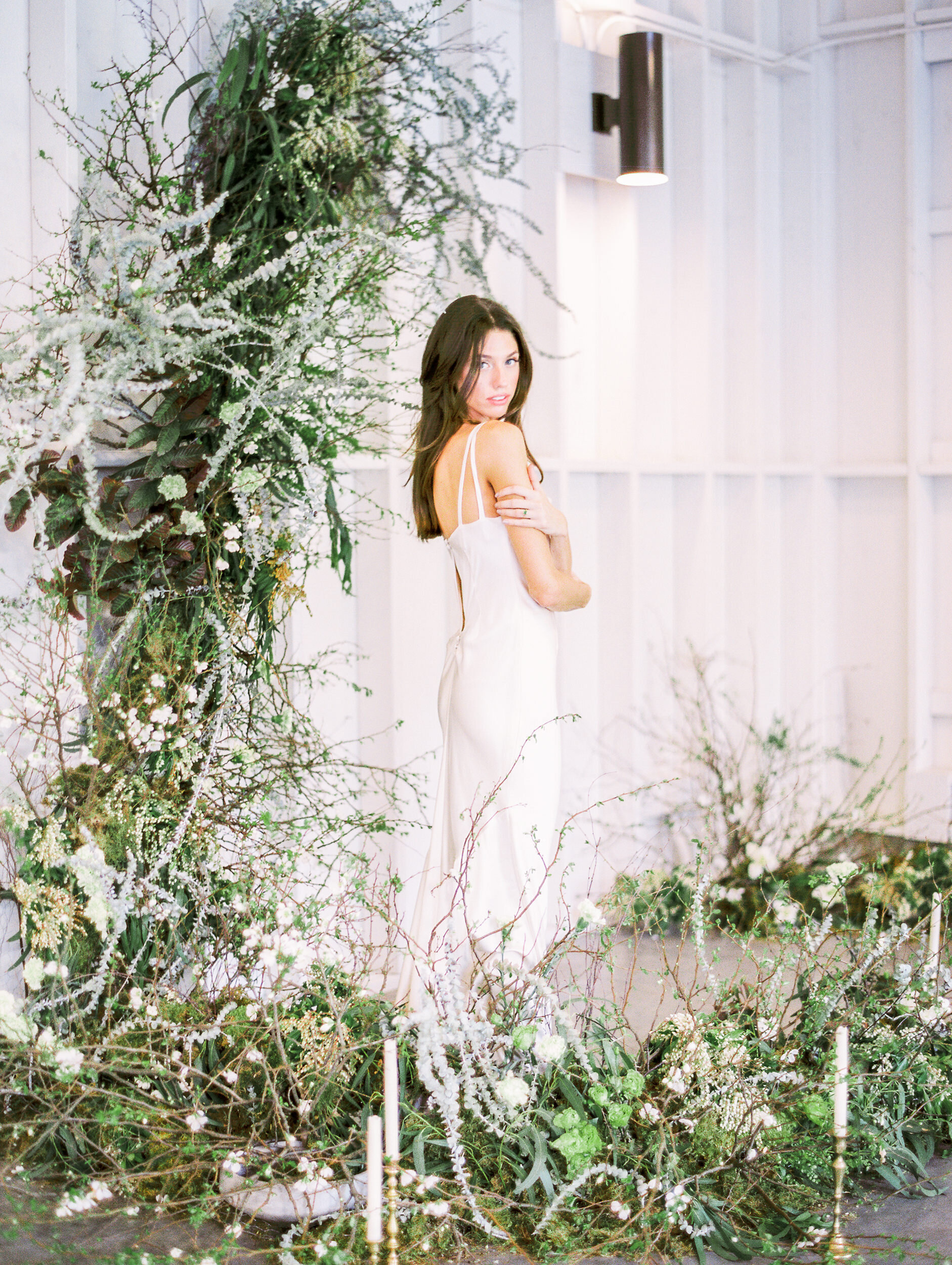
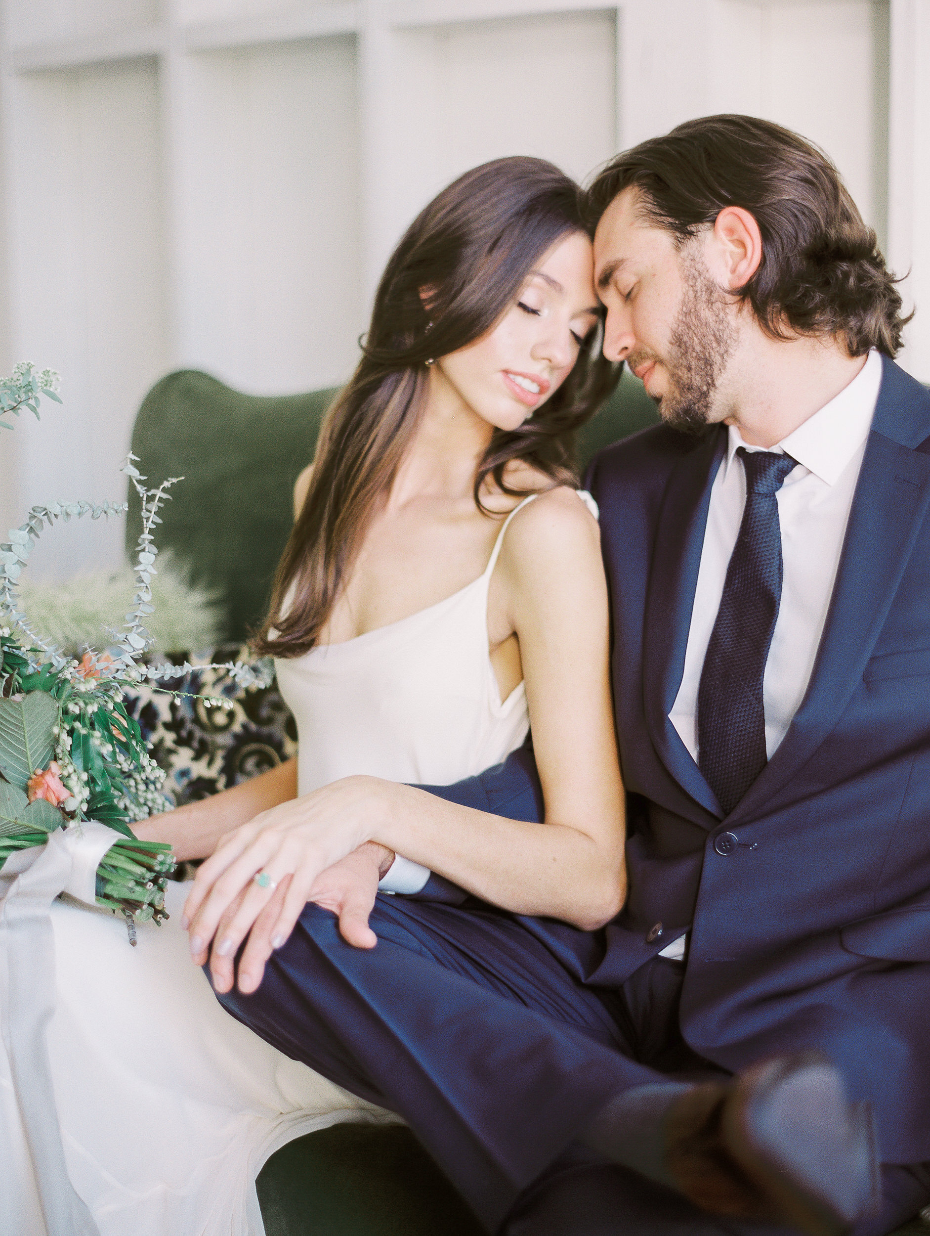
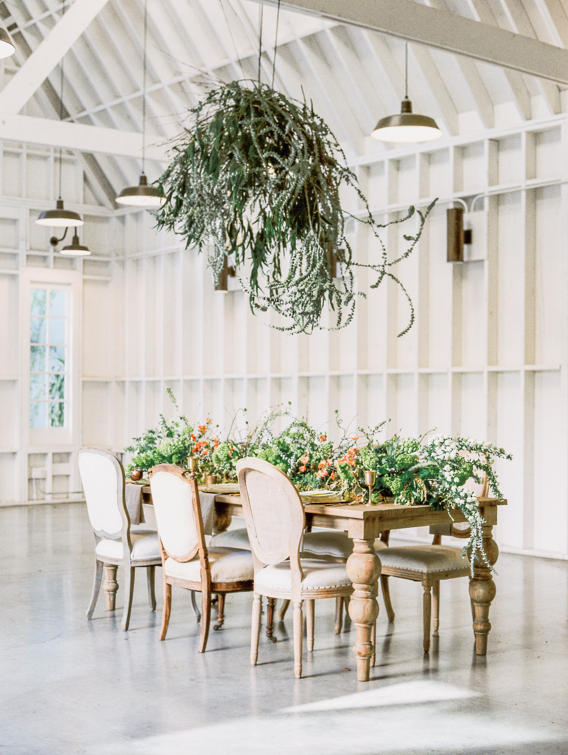
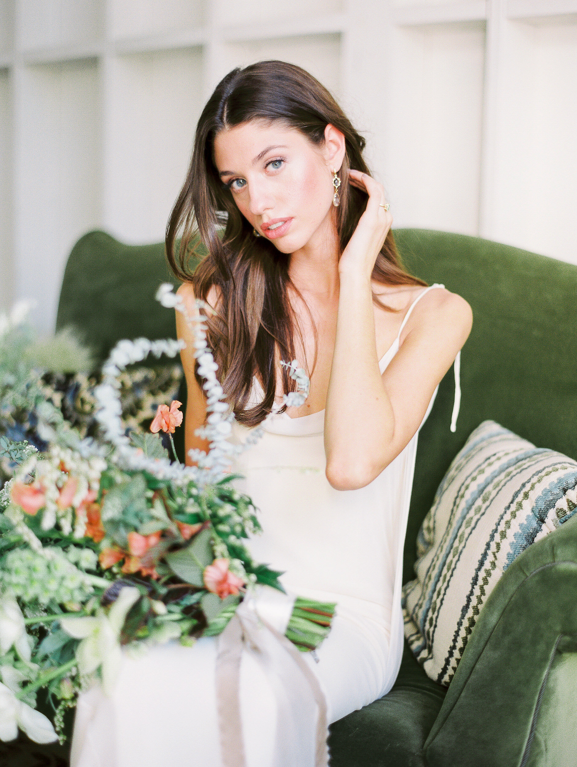
The styled shoot was inspired by the Pantone color of the year: Green! We wanted to make everything looked clean and fresh so we incorporate lots of cascading greeneries against white with pops of gold. This was one of my personal favorite style shoots I got to be a part of and I was so excited to hear the shoot was featured on the cover of Style Me Pretty!
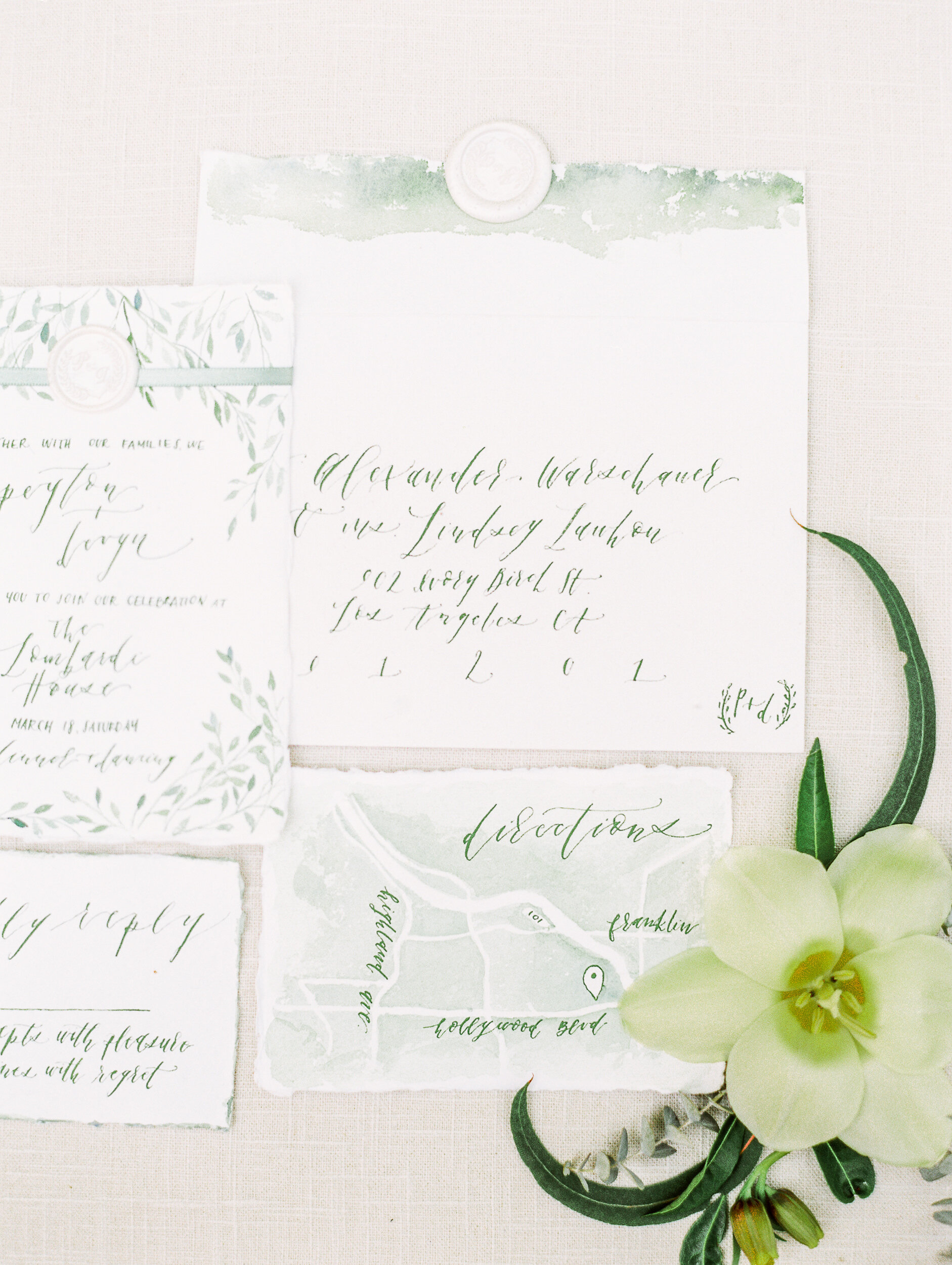
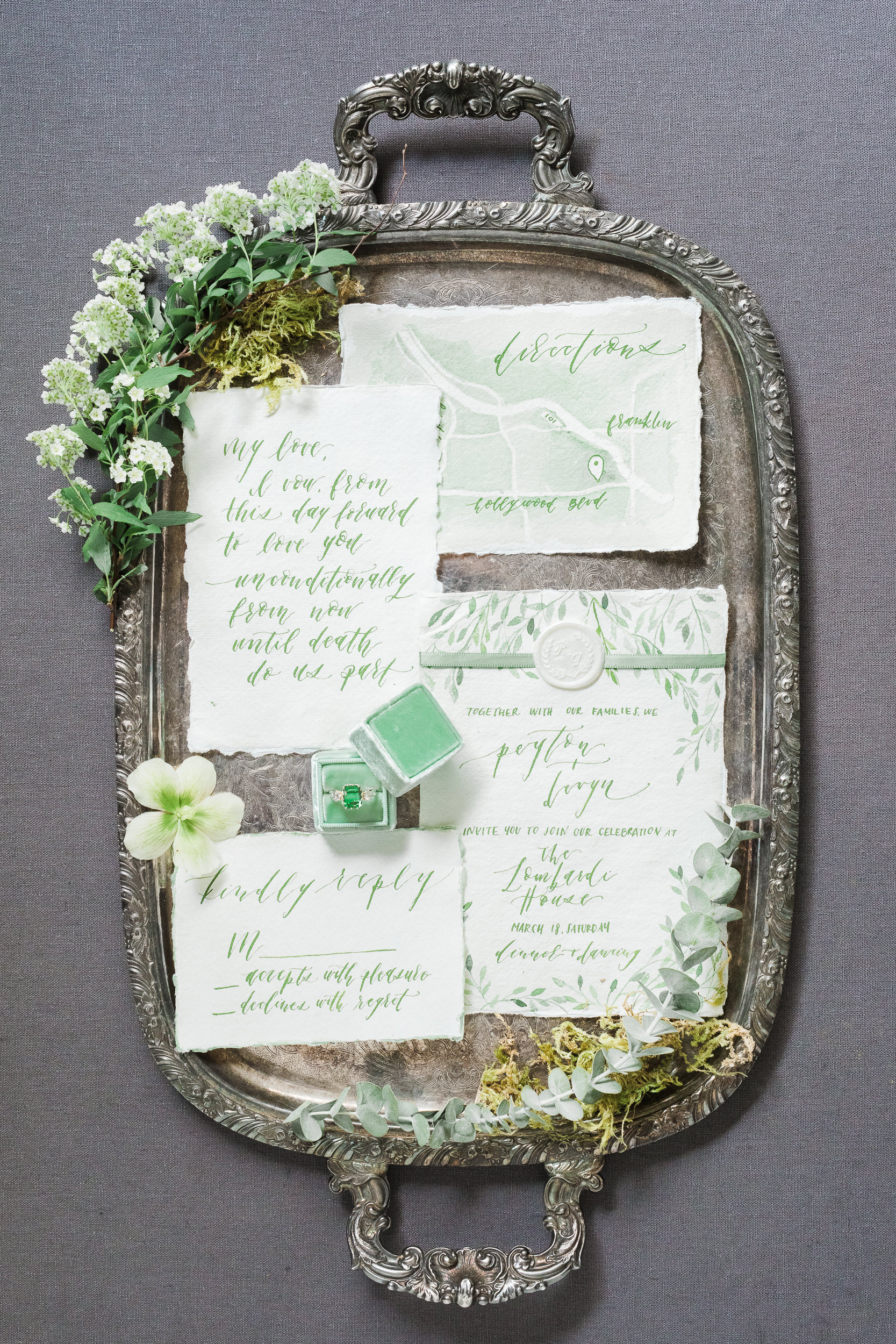
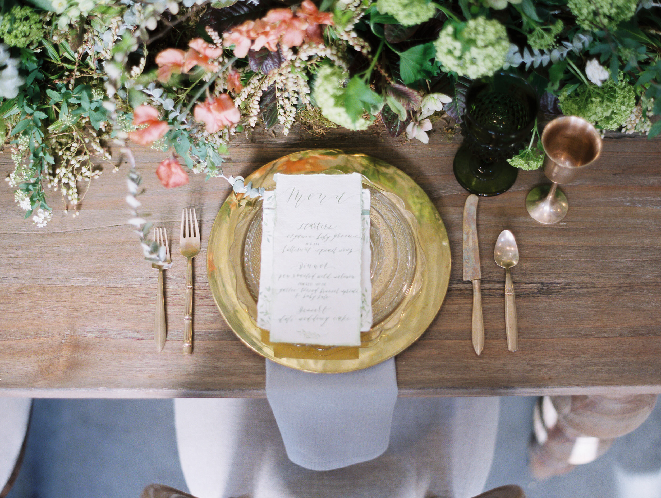
To keep cohesive with the organic feel, I designed this monochromatic suite on cotton rag paper. I absolutely love the texture of handmade paper and the deckle edge added the perfect texture. For design, I wanted a completely hand touch feel so all of the verbiage was calligraphed. Mixed with loose watercolor designs, the suite resulted in an elegant but still playful look. I love to incorporate the venue so I also added in a watercolor illustration of the beautiful Lombardi House into the suite as well.
If you'd like to see more photos, check out our post on Style Me Pretty! To inquire about our custom stationery, be sure to visit our WEDDING tab.
This shoot wouldn't have been possible without these amazing vendors. They are incredibly talented, be sure to check out their work!
Photography @alexwphotography
Styling @ivorybirch
Florals @inessanicholsdesign
Beauty @cheektocheekartistry
Stationery @chasinglinen
Videography @marmofilms
Dress @shopgossamer
Ring @trumpetandhorn
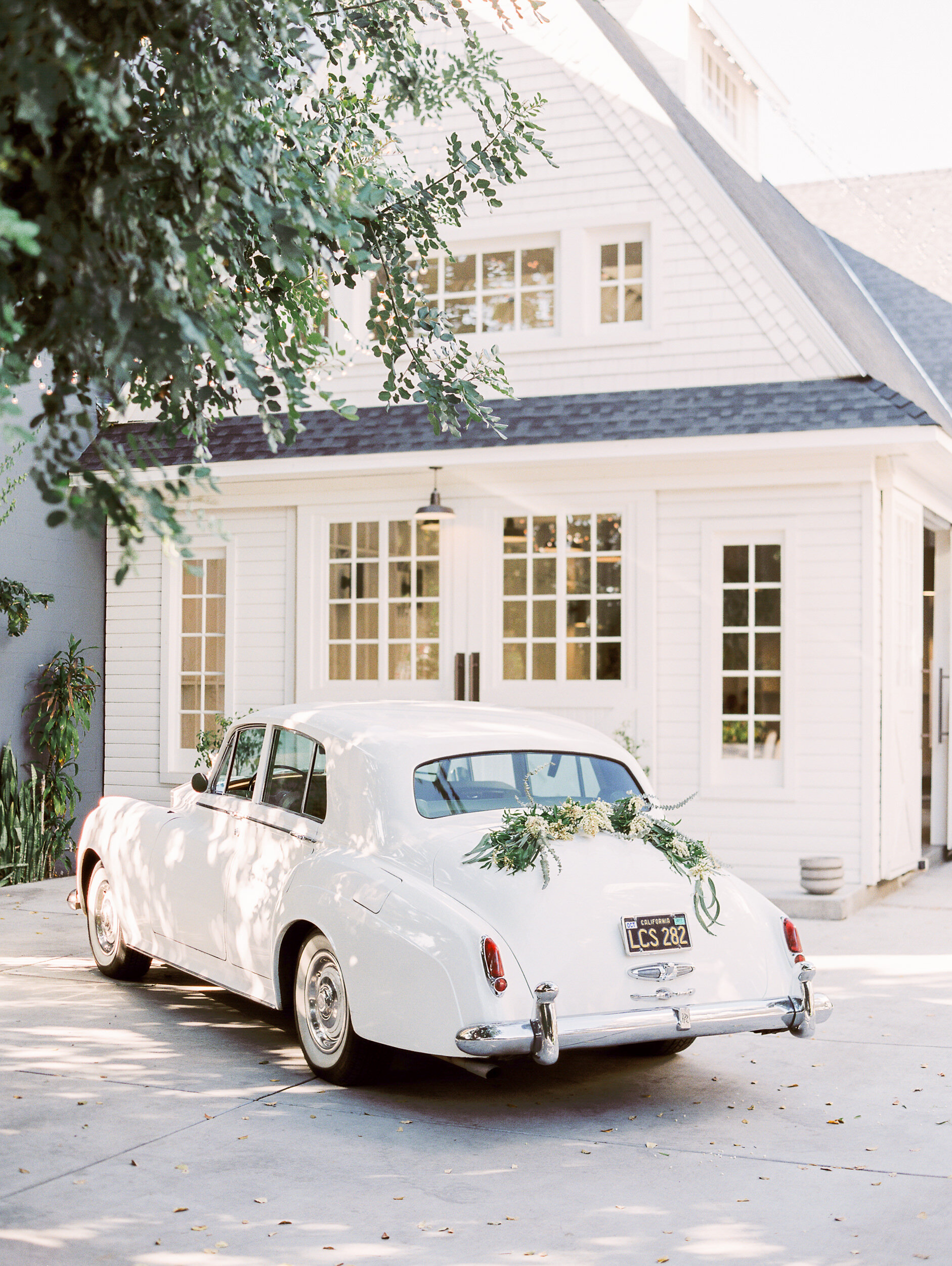
Rentals @classychassisrentals
Venue @lombardihouse
Rentals @archiverentals


